Another pure CSS module. Some styling is part of the `form` module which
will likely follow next.

(cherry picked from commit ff334749f58c71980ec19143bc21c0a799074b30)

Conflicts:
	- web_src/js/components/DashboardRepoList.vue
	  Resolved the conflict by manually applying the Gitea change.
CSS is pretty slim already and the `.ui.toggle.checkbox` sliders on
admin page also still work. The only necessary JS is the one that links
`input` and `label` so that it can be toggled via label. All checkboxes
except the markdown ones render at `--checkbox-size: 16px` now.

<img width="174" alt="Screenshot 2024-03-28 at 22 15 10"
src="3455c1bb-166b-47e4-9847-2d20dd1f04db">

<img width="499" alt="Screenshot 2024-03-28 at 21 00 07"
src="412be2b3-d5a0-478a-b17b-43e6bc12e8ce">

<img width="83" alt="Screenshot 2024-03-28 at 22 14 34"
src="d8c89838-a420-4723-8c49-89405bb39474">

---------

Co-authored-by: delvh <dev.lh@web.de>
(cherry picked from commit 8fd15990c5c8980caf2b9ffefc0b3427efacdc04)
Resolves#29965.
---
Manually tested this by:
- Following the
[installation](https://docs.gitea.com/next/installation/install-with-docker#basics)
guide (but built a local Docker image instead)
- Creating 2 users, one who is the `Owner` of a newly-created repository
and the other a `Collaborator`
- Had the `Collaborator` create a PR that the `Owner` reviews
- `Collaborator` resolves conversation and `Owner` merges PR
And with this change we see that we can no longer see re-request review
button for the `Owner`:
<img width="1351" alt="Screenshot 2024-03-25 at 12 39 18 AM"
src="bcd9c579-3cf7-474f-a51e-b436fe1a39a4">
(cherry picked from commit 242b331260925e604150346e61329097d5731e77)
We have to define this one in helpers.css because tailwind only
generates a single class but certain things rely on this being
double-class. Command ran:

```sh
perl -p -i -e 's#gt-hidden#tw-hidden#g' web_src/js/**/* templates/**/* models/**/* web_src/css/**/*

---------

Co-authored-by: wxiaoguang <wxiaoguang@gmail.com>
(cherry picked from commit ec3d467f15a683b305ac165c3eba6683628dcb25)

Conflicts:
	templates/install.tmpl
	templates/repo/diff/conversation.tmpl
	templates/repo/issue/view_content/conversation.tmpl
	templates/repo/issue/view_content/sidebar.tmpl
	templates/repo/issue/view_title.tmpl

	resolved by prefering Forgejo version and applying the
	commands to all files
Fixes https://github.com/go-gitea/gitea/issues/30005. Regression from
https://github.com/go-gitea/gitea/pull/29945.

There was only once instance of `tw-content-center` before that PR, so I
just ran below command and reverted that one instance.

```sh
perl -p -i -e 's#tw-content-center#tw-items-center#g' web_src/js/**/* templates/**/* models/**/* tests/**/*
```

(cherry picked from commit 04f9ad056882fc3f21b247b16f84437adf0f36d8)

Conflicts:
	templates/repo/diff/conversation.tmpl
	templates/repo/header.tmpl
	templates/repo/issue/filter_list.tmpl
	templates/repo/issue/view_content/conversation.tmpl
	templates/repo/wiki/view.tmpl
	web_src/js/components/DashboardRepoList.vue
	re-ran the command after discarding the Gitea changes to
	ensure all Forgejo files are also covered
Tested a few things, all working fine. Not sure if the chinese machine
translation is good.

---------

Co-authored-by: wxiaoguang <wxiaoguang@gmail.com>
(cherry picked from commit 7e8c1c5ba18e1ac8861f429b825163b8210fd178)

Conflicts:
	docs/content/contributing/guidelines-frontend.zh-cn.md
	Gitea docs
Follow #29165

* some of them are incorrect, which would lead to double escaping (eg:
`(print (Escape $.RepoLink)`)
* other of them are not necessary, because `Tr` handles strings&HTML
automatically

Suggest to review by "unified view":
https://github.com/go-gitea/gitea/pull/29394/files?diff=unified&w=0

(cherry picked from commit d2f6588b66549b33adf8bac7044d03c89d668470)

Conflicts:
	templates/code/searchcombo.tmpl
	templates/mail/auth/register_notify.tmpl
	templates/mail/issue/default.tmpl
	templates/repo/code/recently_pushed_new_branches.tmpl
	templates/repo/search.tmpl
	templates/repo/settings/protected_branch.tmpl
	templates/user/auth/activate.tmpl
	templates/user/auth/forgot_passwd.tmpl
	templates/user/dashboard/feeds.tmpl
	context
Before:

After:

Is this a bug? Maybe we don't need to fix this, as it only occurs when
there's only one user in the organization. 🤔
(cherry picked from commit 78c48d8fdde70a2874a7ed42b7762f797f432b03)
- Closes https://github.com/go-gitea/gitea/issues/28880
This change introduces htmx with the hope we could use it to make Gitea
more reactive while keeping our "HTML rendered on the server" approach.
- Add `htmx.js` that imports `htmx.org` and initializes error toasts
- Place `hx-headers='{"x-csrf-token": "{{.CsrfToken}}"}'` on the
`<body>` tag so every request that htmx sends is authenticated
- Place `hx-swap="outerHTML"` on the `<body>` tag so the response of
each htmx request replaces the tag it targets (as opposed to its inner
content)
- Place `hx-push-url="false"` on the `<body>` tag so no changes to the
URL happen in `<form>` tags
- Add the `is-loading` class during request
### Error toasts in action

## Don't do a full page load when clicking the subscribe button
- Refactor the form around the subscribe button into its own template
- Use htmx to perform the form submission
- `hx-boost="true"` to prevent the default form submission behavior of a
full page load
- `hx-sync="this:replace"` to replace the current request (in case the
button is clicked again before the response is returned)
- `hx-target="this"` to replace the form tag with the new form tag
- Change the backend response to return a `<form>` tag instead of a
redirect to the issue page
### Before

### After

## Don't do a full page load when clicking the follow button
- Use htmx to perform the button request
- `hx-post="{{.ContextUser.HomeLink}}?action=follow"` to send a POST
request to follow the user
- `hx-target="#profile-avatar-card"` to target the card div for
replacement
- `hx-indicator="#profile-avatar-card"` to place the loading indicator
on the card
- Change the backend response to return a `<div>` tag (the card) instead
of a redirect to the user page
### Before

### After

---------
Signed-off-by: Yarden Shoham <git@yardenshoham.com>
Co-authored-by: 6543 <m.huber@kithara.com>
Co-authored-by: Giteabot <teabot@gitea.io>
- Refactor the form around the subscribe button into its own template
- Use htmx to perform the form submission
- `hx-boost="true"` to prevent the default form submission behavior of a
full page load
- `hx-sync="this:replace"` to replace the current request (in case the
button is clicked again before the response is returned)
- `hx-target="this"` to replace the form tag with the new form tag
- `hx-push-url="false"` to disable a change to the URL
- `hx-swap="show:no-scroll"` to preserve the scroll position
- Change the backend response to return a `<form>` tag instead of a
redirect to the issue page
- Include `htmx.org` in javascript imports
This change introduces htmx with the hope we could use it to make Gitea
more reactive while keeping our "HTML rendered on the server" approach.
# Before

# After

---------
Signed-off-by: Yarden Shoham <git@yardenshoham.com>
Part of #27065

This PR touches functions used in templates. As templates are not static
typed, errors are harder to find, but I hope I catch it all. I think
some tests from other persons do not hurt.
I think it's better if the primary actions have primary color instead of
green which fits better into the overall single-color UI design. This PR
currently replaces every green button with primary:

<img width="141" alt="Screenshot 2023-09-16 at 14 07 59"
src="843c1e50-4fb2-4ec6-84ba-0efb9472dcbe">
<img width="161" alt="Screenshot 2023-09-16 at 14 07 51"
src="9442195a-a3b2-4a42-b262-8377d6f5c0d1">

Modal actions now use uncolored/primary instead of previous green/red
colors. I also removed the box-shadow on all basic buttons:

<img width="259" alt="Screenshot 2023-09-16 at 14 16 39"
src="5beea529-127a-44b0-8d4c-afa7b034a490">
<img width="261" alt="Screenshot 2023-09-16 at 14 17 42"
src="4757f7b2-4d46-49bc-a797-38bb28437b88">

The change currently includes the "Merge PR" button, for which we might
want to make an exception to match the icon color there:

<img width="442" alt="Screenshot 2023-09-16 at 14 33 53"
src="993ac1a5-c94d-4895-b76c-0d872181a70b">
Close#27012
By the way, rename the single-word ID to a long ID.


1. Use `gt-invisible` instead of `invisible`.
2. Use `gt-word-break` instead of `dont-break-out` (there is a slight
different "hyphens", but I think it won't affect too much since it is
only used for the "full name").
3. Remove `.small.button:has(svg)` , now our buttons could layout SVG
correctly, and actually I didn't see this CSS class is used in code.
Fix#26731
Almost all "tabindex" in code are incorrect.
1. All "input/button" by default are focusable, so no need to use "tabindex=0"
2. All "div/span" by default are not focusable, so no need to use "tabindex=-1"
3. All "dropdown" are focusable by framework, so no need to use "tabindex"
4. Some tabindex values are incorrect (eg: `new_form.tmpl`), so remove them
Co-authored-by: Giteabot <teabot@gitea.io>
Removed CSS helper classes (some of them are not useful while some of
them are abused often)
* `gt-db`: in most cases it could be replaced by `gt-df` and the flex
layout should be encouraged. Other cases: either it does need the
`gt-df` (eg: by using `div` directly) or it is an abuse (eg: the warning
message in a form)
* `gt-di`: it doesn't seem useful, or it could be replaced by `gt-dib`
in most cases.
* `gt-dif`: not useful, it could be replaced by `flex-text-inline` or
`gt-df`
* `gt-js`: never used
* All `<i class="icon gt-df gt-ac gt-jc">` could be written as `<i
class="icon">`
## Some UI samples
### Admin Notice

### Admin Stacktrace

### Org Home

### Org Team Repo

### Release List

### User Setting Application Token Scope

Co-authored-by: Giteabot <teabot@gitea.io>
Closes#26263
We have to pass the date without the time.
# Before

# After

Signed-off-by: Yarden Shoham <git@yardenshoham.com>
I find the colored buttons in the issue sidebar distracting, given that
they are not primary actions, I think we can de-colorize them.

Before:
<img width="285" alt="Screenshot 2023-07-26 at 19 42 22"
src="7e784805-4e01-4199-94bb-0538a0130264">
<img width="288" alt="Screenshot 2023-07-26 at 19 43 06"
src="3a89c661-e24a-4ebf-a585-d404d0a6a78a">
<img width="285" alt="Screenshot 2023-07-26 at 19 44 36"
src="c1aa8c13-6f41-4763-8149-d1c07cb4be5c">:

After:
<img width="286" alt="Screenshot 2023-07-26 at 19 42 04"
src="74d640c2-e0ab-4fef-87aa-9e788e9010e2">
<img width="285" alt="Screenshot 2023-07-26 at 19 42 51"
src="3b69976a-9aa4-4e1c-8df3-4168f4a9fcf9">
<img width="286" alt="Screenshot 2023-07-26 at 19 45 15"
src="897222fd-4df2-4d99-98eb-e5f8fb77c4d6">
Should look exactly like before for normal dividers. "Horizontal" ones
look better because they no longer use image backgrounds.

<img width="917" alt="Screenshot 2023-06-27 at 19 07 56"
src="d97d8dec-6859-44a8-85ba-e4549b4dd9df">

<img width="914" alt="Screenshot 2023-06-27 at 19 05 58"
src="8bf98544-2d82-4ebf-ac68-d6dc237bd6b2">

<img width="1246" alt="Screenshot 2023-06-27 at 19 00 42"
src="36a6bb21-6029-4f53-8bee-535f55c66fed">

<img width="344" alt="Screenshot 2023-06-27 at 18 58 15"
src="a9e70aee-8e6b-4ea1-9e93-19c9f96aec6e">
<img width="823" alt="Screenshot 2023-06-27 at 18 56 22"
src="e7a497cd-f262-4683-8872-23c3c8cce32f">

<img width="330" alt="Screenshot 2023-06-27 at 19 21 11"
src="42f24149-a655-4c7e-bd26-8ab52db6446b">
Before:

<img width="364" alt="Screen Shot 2023-06-20 at 11 59 11"
src="ad284b7e-8d21-43be-b178-bbcfd37cb5bd">

Might trigger many posts when keep clicking the buttons above.

<img width="448" alt="Screen Shot 2023-06-20 at 11 52 28"
src="a60aa6ac-af74-45e4-b13a-512b436b81b0">
<img width="678" alt="Screen Shot 2023-06-20 at 11 52 37"
src="d6662700-3643-4cc7-a2ec-64e1c0f5fbdb">

After (PR sidebar, Same for issue):


9df3ad1f-e29c-439b-8bde-e6b917d63cc6

For delete, it is using `base/modal_actions_confirm` subtemplate, and we
might need another general solution for this (maybe add another
attribute to the subtemplate or something)

---------

Co-authored-by: silverwind <me@silverwind.io>
Co-authored-by: Giteabot <teabot@gitea.io>
Co-authored-by: wxiaoguang <wxiaoguang@gmail.com>
So I found this [linter](https://github.com/Riverside-Healthcare/djlint)
which features a mode for go templates, so I gave it a try and it did
find a number of valid issue, like unbalanced tags etc. It also has a
number of bugs, I had to disable/workaround many issues.

Given that this linter is written in python, this does add a dependency
on `python` >= 3.8 and `poetry` to the development environment to be
able to run this linter locally.

- `e.g.` prefixes on placeholders are removed because the linter had a
false-positive on `placeholder="e.g. cn=Search"` for the `attr=value`
syntax and it's not ideal anyways to write `e.g.` into a placeholder
because a placeholder is meant to hold a sample value.
- In `templates/repo/settings/options.tmpl` I simplified the logic to
not conditionally create opening tags without closing tags because this
stuff confuses the linter (and possibly the reader as well).
Fix#25133
Thanks @wxiaoguang @silverwind.
I'm sorry I made a mistake, it will be fixed in this PR.
---------
Co-authored-by: Giteabot <teabot@gitea.io>
Co-authored-by: silverwind <me@silverwind.io>
Fixes https://github.com/go-gitea/gitea/issues/25130

The old code uses `$(this).next()` to get `dismiss-review-modal`.
At first, it will get `$(#dismiss-review-modal)`, but the next time it
will get `$(#dismiss-review-modal).next();`
and then `$(#dismiss-review-modal).next().next();`.
Because div `dismiss-review-modal` will be removed when
`dismiss-review-btn` clicked.

Maybe the right usage is adding `show-modal` class and `data-modal`
attribute.
View diff:
https://github.com/go-gitea/gitea/pull/24738/files?diff=unified&w=1

Improve layout and functionality in review area:

<img width="439" alt="Screenshot 2023-05-15 at 20 10 01"
src="be10452b-5829-4927-8801-7b26a57b3dbd">

Remove the "Reviewers" timeline box that appears before the merge box.
it's a duplicate of the top-right review area and all functionality of
it has been moved to the other box:

<img width="868" alt="Screenshot 2023-05-15 at 19 39 31"
src="35489445-e54b-40d3-b3cf-38d029478f96">

Increase timeline item vertical padding from 12px to 16px:

<img width="449" alt="Screenshot 2023-05-15 at 19 43 50"
src="919c4f9d-a485-4f51-b08c-2c0fc714a413">

---------

Co-authored-by: Giteabot <teabot@gitea.io>
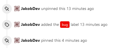
This adds the ability to pin important Issues and Pull Requests. You can
also move pinned Issues around to change their Position. Resolves#2175.
## Screenshots
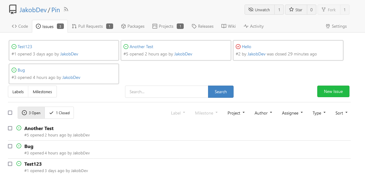
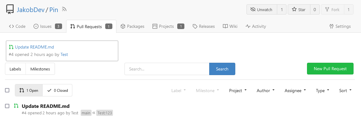
The Design was mostly copied from the Projects Board.
## Implementation
This uses a new `pin_order` Column in the `issue` table. If the value is
set to 0, the Issue is not pinned. If it's set to a bigger value, the
value is the Position. 1 means it's the first pinned Issue, 2 means it's
the second one etc. This is dived into Issues and Pull requests for each
Repo.
## TODO
- [x] You can currently pin as many Issues as you want. Maybe we should
add a Limit, which is configurable. GitHub uses 3, but I prefer 6, as
this is better for bigger Projects, but I'm open for suggestions.
- [x] Pin and Unpin events need to be added to the Issue history.
- [x] Tests
- [x] Migration
**The feature itself is currently fully working, so tester who may find
weird edge cases are very welcome!**
---------
Co-authored-by: silverwind <me@silverwind.io>
Co-authored-by: Giteabot <teabot@gitea.io>