Fixes#26548
This PR refactors the rendering of markup links. The old code uses
`strings.Replace` to change some urls while the new code uses more
context to decide which link should be generated.
The added tests should ensure the same output for the old and new
behaviour (besides the bug).
We may need to refactor the rendering a bit more to make it clear how
the different helper methods render the input string. There are lots of
options (resolve links / images / mentions / git hashes / emojis / ...)
but you don't really know what helper uses which options. For example,
we currently support images in the user description which should not be
allowed I think:
<details>
<summary>Profile</summary>
https://try.gitea.io/KN4CK3R

</details>
---------
Co-authored-by: wxiaoguang <wxiaoguang@gmail.com>
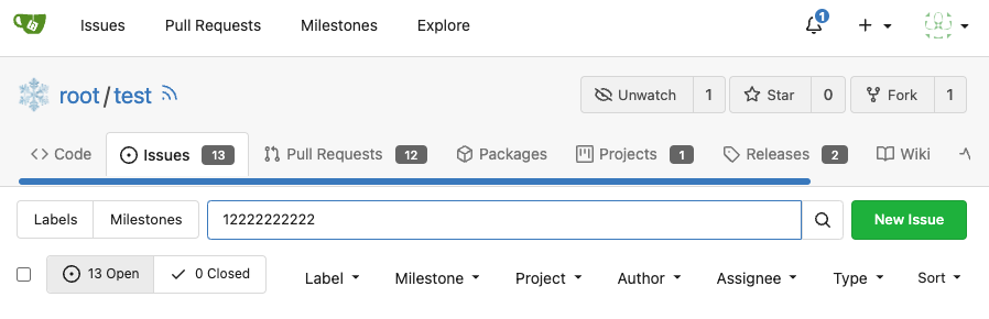
It will fix#28268 .
<img width="1313" alt="image"
src="cb1e07d5-7a12-4691-a054-8278ba255bfc">
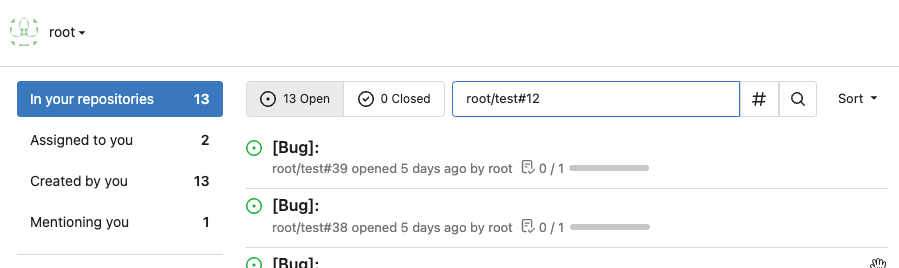
<img width="1318" alt="image"
src="4fd60820-97f1-4c2c-a233-d3671a5039e9">
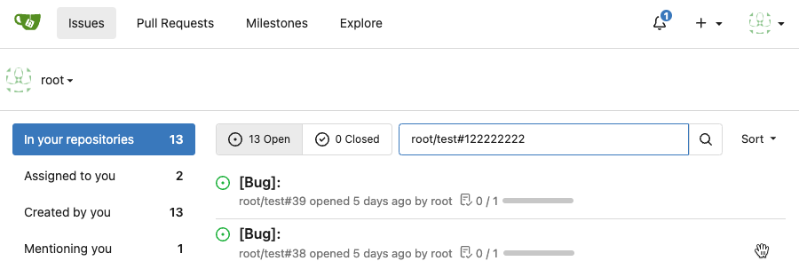
## ⚠️ BREAKING ⚠️
But need to give up some features:
<img width="1312" alt="image"
src="281c0d51-0e7d-473f-bbed-216e2f645610">
However, such abandonment may fix#28055 .
## Backgroud
When the user switches the dashboard context to an org, it means they
want to search issues in the repos that belong to the org. However, when
they switch to themselves, it means all repos they can access because
they may have created an issue in a public repo that they don't own.
<img width="286" alt="image"
src="182dcd5b-1c20-4725-93af-96e8dfae5b97">
It's a confusing design. Think about this: What does "In your
repositories" mean when the user switches to an org? Repos belong to the
user or the org?
Whatever, it has been broken by #26012 and its following PRs. After the
PR, it searches for issues in repos that the dashboard context user owns
or has been explicitly granted access to, so it causes #28268.
## How to fix it
It's not really difficult to fix it. Just extend the repo scope to
search issues when the dashboard context user is the doer. Since the
user may create issues or be mentioned in any public repo, we can just
set `AllPublic` to true, which is already supported by indexers. The DB
condition will also support it in this PR.
But the real difficulty is how to count the search results grouped by
repos. It's something like "search issues with this keyword and those
filters, and return the total number and the top results. **Then, group
all of them by repo and return the counts of each group.**"
<img width="314" alt="image"
src="5206eb20-f8f5-49b9-b45a-1be2fcf679f4">
Before #26012, it was being done in the DB, but it caused the results to
be incomplete (see the description of #26012).
And to keep this, #26012 implement it in an inefficient way, just count
the issues by repo one by one, so it cannot work when `AllPublic` is
true because it's almost impossible to do this for all public repos.
1bfcdeef4c/modules/indexer/issues/indexer.go (L318-L338)
## Give up unnecessary features
We may can resovle `TODO: use "group by" of the indexer engines to
implement it`, I'm sure it can be done with Elasticsearch, but IIRC,
Bleve and Meilisearch don't support "group by".
And the real question is, does it worth it? Why should we need to know
the counts grouped by repos?
Let me show you my search dashboard on gitea.com.
<img width="1304" alt="image"
src="2bca2d46-6c71-4de1-94cb-0c9af27c62ff">
I never think the long repo list helps anything.
And if we agree to abandon it, things will be much easier. That is this
PR.
## TODO
I know it's important to filter by repos when searching issues. However,
it shouldn't be the way we have it now. It could be implemented like
this.
<img width="1316" alt="image"
src="99ee5f21-cbb5-4dfe-914d-cb796cb79fbe">
The indexers support it well now, but it requires some frontend work,
which I'm not good at. So, I think someone could help do that in another
PR and merge this one to fix the bug first.
Or please block this PR and help to complete it.
Finally, "Switch dashboard context" is also a design that needs
improvement. In my opinion, it can be accomplished by adding filtering
conditions instead of "switching".
Same as https://github.com/go-gitea/gitea/pull/26046 but for user
dashboard, the sidebar got a bit smaller and there is less padding
between sections.

<img width="1265" alt="image"
src="0c8d2faa-03ec-4515-a4f2-0a106ef2a928">
Various improvements related to feeds:

- Fix markdown rendering
- Increase font size from 13px to default 14px via `flex-item`
- Add style to hashes
- Move the timestamp to title line. I realize it's not optimal for
translation, we may need to change all these translations

Before:
<img width="768" alt="Screenshot 2023-09-29 at 22 52 58"
src="edda8b84-23cf-4a43-90ad-a892798f4e6c">

After:
<img width="781" alt="Screenshot 2023-09-29 at 22 58 09"
src="7097474d-efcf-4f22-a2ab-834a4e25c4e8">
Part of #27065

This PR touches functions used in templates. As templates are not static
typed, errors are harder to find, but I hope I catch it all. I think
some tests from other persons do not hurt.
I think it's better if the primary actions have primary color instead of
green which fits better into the overall single-color UI design. This PR
currently replaces every green button with primary:

<img width="141" alt="Screenshot 2023-09-16 at 14 07 59"
src="843c1e50-4fb2-4ec6-84ba-0efb9472dcbe">
<img width="161" alt="Screenshot 2023-09-16 at 14 07 51"
src="9442195a-a3b2-4a42-b262-8377d6f5c0d1">

Modal actions now use uncolored/primary instead of previous green/red
colors. I also removed the box-shadow on all basic buttons:

<img width="259" alt="Screenshot 2023-09-16 at 14 16 39"
src="5beea529-127a-44b0-8d4c-afa7b034a490">
<img width="261" alt="Screenshot 2023-09-16 at 14 17 42"
src="4757f7b2-4d46-49bc-a797-38bb28437b88">

The change currently includes the "Merge PR" button, for which we might
want to make an exception to match the icon color there:

<img width="442" alt="Screenshot 2023-09-16 at 14 33 53"
src="993ac1a5-c94d-4895-b76c-0d872181a70b">
Some small dashboard tweaks:

- Remove margin-bottom from divider so first item does not appear to
have un-equal margins
- Restore previous icon color
- Add slight margin-right to icon

Before:
<img width="783" alt="Screenshot 2023-08-31 at 00 10 28"
src="b75f70d7-8704-4afb-866d-fea0484c52d4">

After:
<img width="783" alt="Screenshot 2023-08-31 at 00 10 08"
src="50ed0c47-6f7c-449e-a054-13091369d43f">

---------

Co-authored-by: wxiaoguang <wxiaoguang@gmail.com>
Each change is tested manually line by line. There are too many changes
so I can't share dozens of screenshots.

In short:

1. `ui right` could be still used in `ui top attached header`, because
there is a special case.
2. A lot of `ui right` are just no-op, so they can be removed safely.
3. Some of the `ui right` should be replaced by `gt-float-right` (to
avoid breaking, leave them to the future).
4. A few of the `ui right` could be rewritten by flex.
Fix#26731
Almost all "tabindex" in code are incorrect.
1. All "input/button" by default are focusable, so no need to use "tabindex=0"
2. All "div/span" by default are not focusable, so no need to use "tabindex=-1"
3. All "dropdown" are focusable by framework, so no need to use "tabindex"
4. Some tabindex values are incorrect (eg: `new_form.tmpl`), so remove them
Co-authored-by: Giteabot <teabot@gitea.io>
This PR has multiple parts, and I didn't split them because
it's not easy to test them separately since they are all about the
dashboard page for issues.
1. Support counting issues via indexer to fix#26361
2. Fix repo selection so it also fixes#26653
3. Keep keywords in filter links.
The first two are regressions of #26012.
After:
71dfea7e-d9e2-42b6-851a-cc081435c946
Thanks to @CaiCandong for helping with some tests.
This PR introduces a new UI element type for Gitea called `flex-item`.
It consists of a horizontal card with a leading, main and trailing part:

The idea behind it is that in Gitea UI, we have many cases where we use
this kind of layout, but it is achieved in many different ways:
- grid layout
- `.ui.list` with additional hacky flexbox
- `.ui.key.list` - looks to me like a style set originally created for
ssh/gpg key list, was used in many other places
- `.issue.list` - created for issue cards, used in many other places
- ...
This new style is based on `.issue.list`, specifically the refactoring
of it done in #25750.
In this PR, the new element is introduced and lots of templates are
being refactored to use that style. This allows to remove a lot of
page-specific css, makes many of the elements responsive or simply
provides a cleaner/better-looking way to present information.
A devtest section with the new style is also available.
<details>
<summary>Screenshots (left: before, right: after)</summary>


</details>
---------
Co-authored-by: Giteabot <teabot@gitea.io>
Should look exactly like before for normal dividers. "Horizontal" ones
look better because they no longer use image backgrounds.

<img width="917" alt="Screenshot 2023-06-27 at 19 07 56"
src="d97d8dec-6859-44a8-85ba-e4549b4dd9df">

<img width="914" alt="Screenshot 2023-06-27 at 19 05 58"
src="8bf98544-2d82-4ebf-ac68-d6dc237bd6b2">

<img width="1246" alt="Screenshot 2023-06-27 at 19 00 42"
src="36a6bb21-6029-4f53-8bee-535f55c66fed">

<img width="344" alt="Screenshot 2023-06-27 at 18 58 15"
src="a9e70aee-8e6b-4ea1-9e93-19c9f96aec6e">
<img width="823" alt="Screenshot 2023-06-27 at 18 56 22"
src="e7a497cd-f262-4683-8872-23c3c8cce32f">

<img width="330" alt="Screenshot 2023-06-27 at 19 21 11"
src="42f24149-a655-4c7e-bd26-8ab52db6446b">
- Set
[type=search](https://developer.mozilla.org/en-US/docs/Web/HTML/Element/input/search)
- Disable spellcheck
- Set maxLength 255 that I found in `templates/repo/issue/search.tmpl`
- Remove unnecessary `max-width`, it does nothing

---------

Co-authored-by: delvh <dev.lh@web.de>
Co-authored-by: Giteabot <teabot@gitea.io>
Numerous small UI fixes:

- Fix double border in collaborator list
- Fix system notice table background
- Mute links in repo and org lists
- Downsize projects edit buttons
- Improve milestones and project list rendering
- Condense milestone list entry to a single line of "metas"
- Mute ".." button in repo files list
Various fixes to pages or elements which were looking ugly on mobile.
<details>
<summary>Screenshots</summary>


</details>
Co-authored by @silverwind
---------
Co-authored-by: silverwind <me@silverwind.io>
- Fix and improve mobile navbar layout
- Apply all cleanups suggested in
https://github.com/go-gitea/gitea/pull/25111
- Make media query breakpoints match Fomantic's exactly
- Clean up whitespace in class on navbar items

Mobile navbar before and after:
<img width="745" alt="Screenshot 2023-06-08 at 08 40 56"
src="ca84b239-b10f-41db-8c06-dcf2b6dd9d28">
<img width="739" alt="Screenshot 2023-06-08 at 08 41 23"
src="09133c54-eb7e-4110-858c-ead23c3b7521">

---------

Co-authored-by: wxiaoguang <wxiaoguang@gmail.com>
Co-authored-by: Giteabot <teabot@gitea.io>
Was only an issue on arc-green:

### Before
<img width="313" alt="Screenshot 2023-05-17 at 23 33 15"
src="0f6916c6-c6c3-43c8-84cc-24b0a9800a43">

### After
<img width="310" alt="Screenshot 2023-05-17 at 23 32 52"
src="207d3d7f-ce6f-4170-b426-e743be760185">

Co-authored-by: Giteabot <teabot@gitea.io>
- Make code block rendering via backticks work
- Remove link color unless hovered
- Remove table stripes and fix stripes rendering on dark theme for other
tables
- Introduce new `button-link` class discussed previously for buttons
that look and act like links and apply it to the two right-side buttons
- Reduce box padding by 8px on each side
- Fix "Mark all read" button margin-right
- brighten `--color-markup-code-block` on arc-green

### Before
<img width="1216" alt="Screenshot 2023-05-10 at 20 00 30"
src="66da9ec2-dd09-4ef0-8f1d-1822a18b6b43">
<img width="1211" alt="Screenshot 2023-05-10 at 20 00 48"
src="f48e30a2-9a00-4723-93aa-79b97ca0ba0c">

### After
<img width="1222" alt="Screenshot 2023-05-10 at 20 09 59"
src="c956e0d0-b3d9-42a4-a3ed-f0431c22bf3f">
<img width="1218" alt="Screenshot 2023-05-10 at 20 05 34"
src="f72c1628-3961-4c28-9263-07cdf7531316">
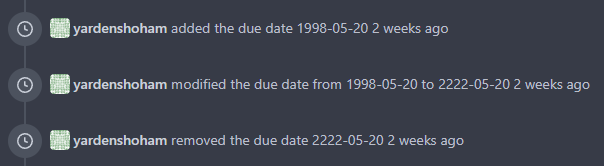
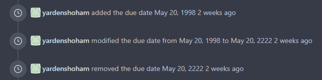
This refactors the `shared/datetime/short|long|full` templates into a
template helper function, which allows us to render absolute date times
within translatable phrases.
- Follows #23988
- The first attempt was in #24055
- This should help #22664
Changes:
1. Added the `DateTime` template helper that replaces the
`shared/datetime/short|long|full` templates
2. Used find-and-replace with varying regexes to replace the templates
from step 1 (for example, `\{\{template "shared/datetime/(\S+) \(dict
"Datetime" ([^"]+) "Fallback" ([^\)]+\)?) ?\)?\}\}` -> `{{DateTime "$1
$2 $3}}`)
3. Used the new `DateTime` helper in the issue due date timestamp
rendering
# Before
# After
---------
Signed-off-by: Yarden Shoham <git@yardenshoham.com>
Co-authored-by: wxiaoguang <wxiaoguang@gmail.com>