- It's possible for reviews to not be assiocated with users, when they
were migrated from another forge instance. In the migration code,
there's no sanitization check for author names, so they could contain
HTML tags and thus needs to be properely escaped.
- Pass `$reviewerName` trough `Escape`.

(cherry picked from commit fe2df46d05)

Conflicts:
	templates/repo/issue/view_content/comments.tmpl
	trivial context conflict
Backport #26698 by @wxiaoguang

Regression of #23092, the `{{$field := .}}` was missing during that
refactoring.

Co-authored-by: wxiaoguang <wxiaoguang@gmail.com>
(cherry picked from commit 4af872178ebd53ac391939908afa7d95ac311b65)
Backport #26268 by @yardenshoham
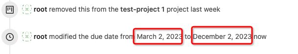
Closes#26263
We have to pass the date without the time.
# Before

# After

Signed-off-by: Yarden Shoham <git@yardenshoham.com>
Co-authored-by: Yarden Shoham <git@yardenshoham.com>
(cherry picked from commit 2cf1515f5c5e048b5f1280e60c54ad3247988ad0)
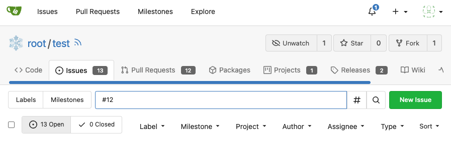
- Backport of https://codeberg.org/forgejo/forgejo/pulls/1293
  - The review type '22' is a general comment type that is attached to
single codecomments, reviews with multiple comments or to simple approve
and request changes comment. This comment can be used to create a link
towards this action on an pull request.
  - Adds an anchor to the review comment type, so that when its getting
linked to it, it actually jumps towards that event.
  - This also now fixes the behavior that after you created a review you
will be redirected to that review and because this is an general comment
type other mails will also be 'fixed' such as the approved or request changes.
  - Resolves https://codeberg.org/forgejo/forgejo/issues/1248
Backport #25583 by @HesterG
Close#25557
Fix regression from #25315
`data-id` is still needed for deleting milestone.
Co-authored-by: HesterG <hestergong@gmail.com>
Backport #25398 by @silverwind

Two small tweaks:

1. Vertically center arrow here when editing a PR:

<img width="405" alt="Screenshot 2023-06-20 at 19 48 49"
src="1d63764d-9fd9-467e-8a8e-9258c06475eb">

2. Use 2-row layout on diff viewed status and show it again on mobile:

<img width="142" alt="Screenshot 2023-06-20 at 19 51 21"
src="3046e782-163c-4f87-910c-a22066de8f1b">

Mobile view:

<img width="370" alt="Screenshot 2023-06-20 at 19 44 40"
src="9cf56347-7323-4d05-99a5-17ad215ee44d">

Co-authored-by: silverwind <me@silverwind.io>
Backport #24936
If enabled show a clickable label in the comment. A click on the label
opens the Conversation tab with the comment focussed - there you're able
to view the old diff (or original diff the comment was created on).
**Screenshots**


When resolved and outdated:

Option to enable/disable this (stored in user settings - default is
disabled):


fixes#24913
Co-authored-by: silverwind <me@silverwind.io>
Backport #25312 by @wxiaoguang
We only needs 2 lines to hide the dividers.
```
$dropdownLabelFilter.dropdown('setting', {'hideDividers': 'empty'});
$dropdownLabelFilter.dropdown('refreshItems');
```
Other code blocks are refactored by the way.


Co-authored-by: wxiaoguang <wxiaoguang@gmail.com>
Backport #25368 by @denyskon
Fix#24846 applying the solution proposed by @silverwind
<details>
<summary>Screenshots</summary>


</details>
Replaces #25335
Co-authored-by: Denys Konovalov <kontakt@denyskon.de>
Backport #25315 by @denyskon
Various fixes to pages or elements which were looking ugly on mobile.
<details>
<summary>Screenshots</summary>


</details>
Co-authored by: @silverwind
Co-authored-by: Denys Konovalov <kontakt@denyskon.de>
Co-authored-by: silverwind <me@silverwind.io>
Backport #24989. Clean cherry-pick aside from one small conflict with
divider.

- Various corrections to button styles, especially secondary
- Remove focus highlight, it's annoying when it stays on button after
press
- Clearly define ghost and link buttons with demos in devtest
- Remove black, grey and tertiary buttons, they should not be used
- Make `arc-green` slightly darker

<img width="1226" alt="image"

src="8d89786a-01ab-40f8-ae5a-e17f40e35084">
<img width="1249" alt="image"

src="83651e6d-3c27-46ff-b8bd-ff344d70e949">
This is adds the progress bar, which is already on the Milestone List,
also to the Page of a Single Milestone.

---------
Co-authored-by: silverwind <me@silverwind.io>
This addressees some things from #24406 that came up after the PR was
merged. Mostly from @delvh.

---------

Co-authored-by: silverwind <me@silverwind.io>
Co-authored-by: delvh <dev.lh@web.de>
View diff:
https://github.com/go-gitea/gitea/pull/24738/files?diff=unified&w=1

Improve layout and functionality in review area:

<img width="439" alt="Screenshot 2023-05-15 at 20 10 01"
src="be10452b-5829-4927-8801-7b26a57b3dbd">

Remove the "Reviewers" timeline box that appears before the merge box.
it's a duplicate of the top-right review area and all functionality of
it has been moved to the other box:

<img width="868" alt="Screenshot 2023-05-15 at 19 39 31"
src="35489445-e54b-40d3-b3cf-38d029478f96">

Increase timeline item vertical padding from 12px to 16px:

<img width="449" alt="Screenshot 2023-05-15 at 19 43 50"
src="919c4f9d-a485-4f51-b08c-2c0fc714a413">

---------

Co-authored-by: Giteabot <teabot@gitea.io>
Don't really know a better name for this. I've gone through some Forms
and added missing HTML attributes (mostly `maxlength`). I tried to fill
the Forms with dummy Data and see if Gitea throws a Error (e.g. maximum
length). If yes, I added the missing HTML attribute.

While working on this, I discovered that the Form to add OAuth2 Apps
just silently fails when filled with invalid data, so I fixed that too.
This adds the ability to pin important Issues and Pull Requests. You can
also move pinned Issues around to change their Position. Resolves#2175.
## Screenshots
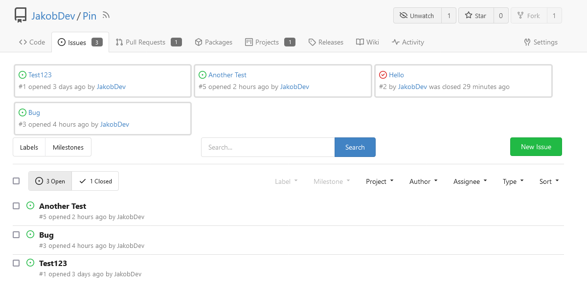
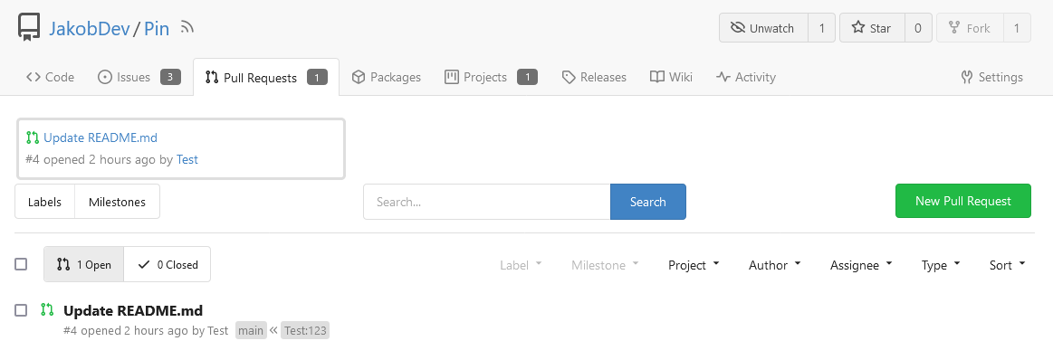
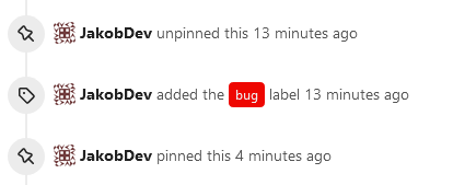
The Design was mostly copied from the Projects Board.
## Implementation
This uses a new `pin_order` Column in the `issue` table. If the value is
set to 0, the Issue is not pinned. If it's set to a bigger value, the
value is the Position. 1 means it's the first pinned Issue, 2 means it's
the second one etc. This is dived into Issues and Pull requests for each
Repo.
## TODO
- [x] You can currently pin as many Issues as you want. Maybe we should
add a Limit, which is configurable. GitHub uses 3, but I prefer 6, as
this is better for bigger Projects, but I'm open for suggestions.
- [x] Pin and Unpin events need to be added to the Issue history.
- [x] Tests
- [x] Migration
**The feature itself is currently fully working, so tester who may find
weird edge cases are very welcome!**
---------
Co-authored-by: silverwind <me@silverwind.io>
Co-authored-by: Giteabot <teabot@gitea.io>
If dropdown is marked as required, we should not provide the `remove`
button.
This will cause user may post empty value which seems like a bug.
Definition:

Post request form:

Result:

There was some recent discussion about this in Discord `ui-design`
channel and the conclusion was that
https://github.com/go-gitea/gitea/issues/24305 should have fixed their
OS font installation to have semibold weights.

I have now tested this 601 weight on a Windows 10 machine on Firefox
myself, and I immediately noticed that bold was excessivly bold and
rendering as 700 because browsers are biased towards bolder fonts. So
revert this back to the previous value.
Visually, nothing should have changed.
Changes include
- Convert most `<a [no href]>` to `<button>` when (re-)viewing files:
- `<a [no href]>` are, by HTML definition, not a link and hence cannot
be focused
- `<a class="ui button">` can now be clicked (again?) using
<kbd>Enter</kbd>
- Previously, the installed keypress handler on `.ui.button` elements
disabled it for links somehow
- The `(un)escape file`, the `expand section` and the `expand/collapse
file` buttons can now be focused (and subsequently clicked using only
the keyboard)
- You can now press <kbd>Space</kbd> on a focused `View file` checkbox
to mark the file as viewed.
- previously, this was impossible as this checkbox listened on the wrong
event listener

The `add code comment` button has been left inaccessible for now as it
requires quite a bit of extra logic so that it is unhidden when it is
focused (you can otherwise focus it without seeing it as you are not
hovering on the corresponding line).

---------

Co-authored-by: silverwind <me@silverwind.io>
Clean up a few cases where avatar dimensions were overwritten via CSS,
which were no longer needed or were possible to set via HTML width.

Also included are two small fixes:

- Fix one more case of incorrect avatar offset on review timeline
- Vertically center avatars in review sidebar

There is more to be done here, but some of the work depends on Fomantic
`comment` module removal, or in the case of org member lists, a refactor
of the `avatarlink` template to accept a size.

<img width="371" alt="image"
src="9c5902fb-2b89-4a7d-a152-60e74c3b2c56">
<img width="306" alt="image"
src="c8d92e2a-91c9-4f4a-a7de-6ae1a6bc0479">

---------

Co-authored-by: Giteabot <teabot@gitea.io>
- Make code block rendering via backticks work
- Remove link color unless hovered
- Remove table stripes and fix stripes rendering on dark theme for other
tables
- Introduce new `button-link` class discussed previously for buttons
that look and act like links and apply it to the two right-side buttons
- Reduce box padding by 8px on each side
- Fix "Mark all read" button margin-right
- brighten `--color-markup-code-block` on arc-green

### Before
<img width="1216" alt="Screenshot 2023-05-10 at 20 00 30"
src="66da9ec2-dd09-4ef0-8f1d-1822a18b6b43">
<img width="1211" alt="Screenshot 2023-05-10 at 20 00 48"
src="f48e30a2-9a00-4723-93aa-79b97ca0ba0c">

### After
<img width="1222" alt="Screenshot 2023-05-10 at 20 09 59"
src="c956e0d0-b3d9-42a4-a3ed-f0431c22bf3f">
<img width="1218" alt="Screenshot 2023-05-10 at 20 05 34"
src="f72c1628-3961-4c28-9263-07cdf7531316">
Partial regression of #24393, not only regression, but broken for long
time, 24393 didn't really improve it but used wrong `overflow: scroll`.

Actually, that "ui secondary filter menu labels" shouldn't be set as
scrollable (I missed that at that time), the problem is: if a "ui menu"
has "dropdown" items, then it should not be scrollable. Otherwise the
dropdown menu can't be shown correctly.

And there are more problems:

* The "issue-filters" shouldn't be used anywhere else (copying&pasting
problem again ....)
* There is also an "issue-actions" container, it should also be fixed.
* There are similar problems on the milestone page.
* The old comment in code: "grid column" doesn't work well.

The major changes of this PR are: use "flex: 1" instead of "ui grid
column".

After this PR, not 100% perfect but much better than before.