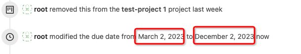
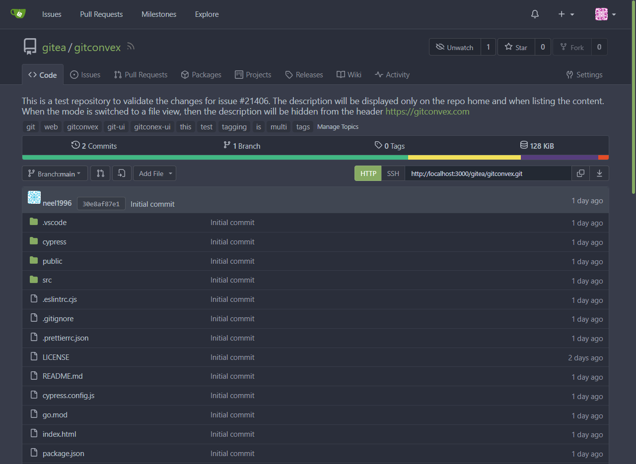
Backport #27924 by @yp05327
In #25315, @denyskon fixed UI on mobile view.
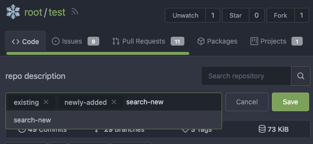
But for the repo description, on desktop view there's no word-break.
So maybe we can just add `gt-word-break` to fix it on both mobile view
and desktop view.
Before:
desktop view:

mobile view:

After:
desktop view:

mobile view(almost same?)

Co-authored-by: yp05327 <576951401@qq.com>
Co-authored-by: silverwind <me@silverwind.io>
Backtick syntax now works in repo description too. Also, I replaced the
CSS for this was a new single class, making it more flexible and not
dependent on a parent. Also, very slightly reduced font size from 16.8px
to 16px.

---------

Co-authored-by: wxiaoguang <wxiaoguang@gmail.com>
Removed CSS helper classes (some of them are not useful while some of
them are abused often)
* `gt-db`: in most cases it could be replaced by `gt-df` and the flex
layout should be encouraged. Other cases: either it does need the
`gt-df` (eg: by using `div` directly) or it is an abuse (eg: the warning
message in a form)
* `gt-di`: it doesn't seem useful, or it could be replaced by `gt-dib`
in most cases.
* `gt-dif`: not useful, it could be replaced by `flex-text-inline` or
`gt-df`
* `gt-js`: never used
* All `<i class="icon gt-df gt-ac gt-jc">` could be written as `<i
class="icon">`
## Some UI samples
### Admin Notice

### Admin Stacktrace

### Org Home

### Org Team Repo

### Release List

### User Setting Application Token Scope

Co-authored-by: Giteabot <teabot@gitea.io>
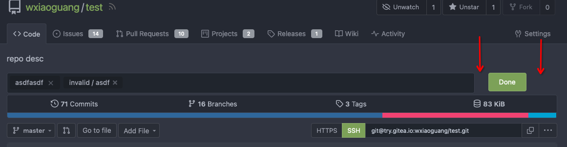
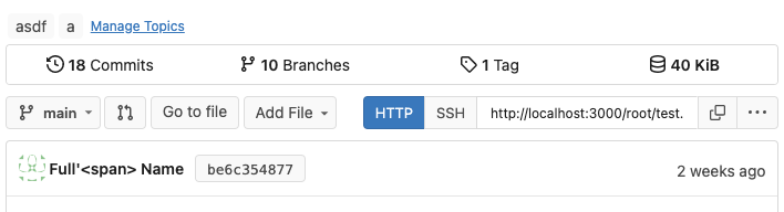
Minor tweaks to repo topics:

- Use gap instead of margin to align "Manage Topics" when no topics
present
- Add margin to description instead

Before:

<img width="1232" alt="Screenshot 2023-07-08 at 13 08 15"
src="a5d3586c-6cbf-4b74-8137-11d91f2cbb45">
<img width="1233" alt="Screenshot 2023-07-08 at 13 08 05"
src="59b18d93-e4cb-4f2b-9bc2-d6aa63f93827">

After:

<img width="1232" alt="Screenshot 2023-07-08 at 13 08 42"
src="470d42ad-3f7e-40f9-b0a1-203b4af77eb9">
<img width="1231" alt="Screenshot 2023-07-08 at 13 08 32"
src="42d18048-748c-4a3f-ab89-3403866cef34">

---------
Archive text title center align
<details>
<summary>Screen shots</summary>
Before

After


BTW On github

</details>
---------
Co-authored-by: Giteabot <teabot@gitea.io>
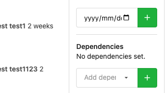
This PR will display a pull request creation hint on the repository home
page when there are newly created branches with no pull request. Only
the recent 6 hours and 2 updated branches will be displayed.
Inspired by #14003
Replace #14003Resolves#311Resolves#13196Resolves#23743
co-authored by @kolaente
I think hiding the add file button for mirror repositories that can keep the ui clean.
Before:

After:

Fixes: https://github.com/go-gitea/gitea/issues/25282

Fix the problems:

1. The `repo-button-row` had various patches before, this PR makes it
consistent
2. The "Add File" has wrong CSS class "icon", remove it
3. The "Add File" padding was overridden by "!important", fix it by
`.repo-button-row .button.dropdown` with comment
4. The selector `.ui.segments ~ .ui.top.attached.header` is incorrect,
it should use `+`
- Various corrections to button styles, especially secondary
- Remove focus highlight, it's annoying when it stays on button after
press
- Clearly define ghost and link buttons with demos in devtest
- Remove black, grey and tertiary buttons, they should not be used
- Make `arc-green` slightly darker

<img width="1226" alt="image"
src="8d89786a-01ab-40f8-ae5a-e17f40e35084">
<img width="1249" alt="image"
src="83651e6d-3c27-46ff-b8bd-ff344d70e949">

---------

Co-authored-by: wxiaoguang <wxiaoguang@gmail.com>
Co-authored-by: Giteabot <teabot@gitea.io>
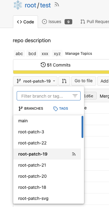
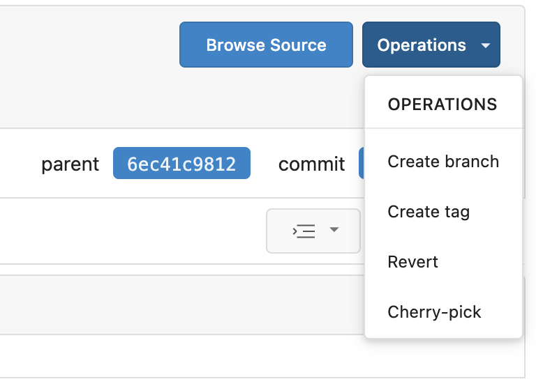
Follow #22719
### Major changes
1. `ServerError` doesn't do format, so remove the `%s`
2. Simplify `RenderBranchFeed` (slightly)
3. Remove unused `BranchFeedRSS`
4. Make `feed.RenderBranchFeed` respect `EnableFeed` config
5. Make `RepoBranchTagSelector.vue` respect `EnableFeed` setting,
otherwise there is always RSS icon
6. The `(branchURLPrefix + item.url).replace('src', 'rss')` doesn't seem
right for all cases, for example, the string `src` could appear in
`branchURLPrefix`, so we need a separate `rssURLPrefix`
7. The `<a>` in Vue menu needs `@click.stop`, otherwise the menu itself
would be triggered at the same time
8. Change `<a><button></button></a>` to `<a role=button>`
9. Use `{{PathEscapeSegments .TreePath}}` instead of `{{range $i, $v :=
.TreeNames}}/{{$v}}{{end}}`
Screenshot of changed parts:
<details>
</details>
### Other thoughts
Should we remove the RSS icon from the branch dropdown list? It seems
too complex for a list UI, and users already have the chance to get the
RSS feed URL from "branches" page.
---------
Co-authored-by: 6543 <6543@obermui.de>
Co-authored-by: silverwind <me@silverwind.io>
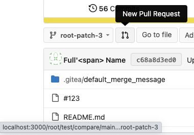
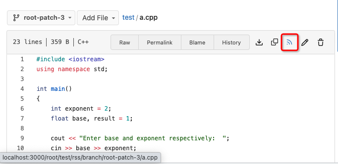
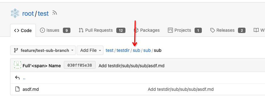
Fix#22228 adding RSS feeds for branches and files.
RSS feeds are accessed through:
* [gitea]/src/branch/{branch}.rss
* [gitea]/src/branch/{branch}/{file_name}.rss
No changes have been made to the UI to expose the feed urls for branches
and files.
One of the proposals in #23328

This PR introduces a simple expression calculator
(templates/eval/eval.go), it can do basic expression calculations.

Many untested template helper functions like `Mul` `Add` can be replaced
by this new approach.

Then these `Add` / `Mul` / `percentage` / `Subtract` / `DiffStatsWidth`
could all use this `Eval`.

And it provides enhancements for Golang templates, and improves
readability.

Some examples:

----

* Before: `{{Add (Mul $glyph.Row 12) 12}}`
* After: `{{Eval $glyph.Row "*" 12 "+" 12}}`

----

* Before: `{{if lt (Add $i 1) (len $.Topics)}}`
* After: `{{if Eval $i "+" 1 "<" (len $.Topics)}}`

## FAQ

### Why not use an existing expression package?

We need a highly customized expression engine:

* do the calculation on the fly, without pre-compiling
* deal with int/int64/float64 types, to make the result could be used in
Golang template.
* make the syntax could be used in the Golang template directly
* do not introduce too much complex or strange syntax, we just need a
simple calculator.
* it needs to strictly follow Golang template's behavior, for example,
Golang template treats all non-zero values as truth, but many 3rd
packages don't do so.

### What's the benefit?

* Developers don't need to add more `Add`/`Mul`/`Sub`-like functions,
they were getting more and more.
Now, only one `Eval` is enough for all cases.
* The new code reads better than old `{{Add (Mul $glyph.Row 12) 12}}`,
the old one isn't familiar to most procedural programming developers
(eg, the Golang expression syntax).
* The `Eval` is fully covered by tests, many old `Add`/`Mul`-like
functions were never tested.

### The performance?

It doesn't use `reflect`, it doesn't need to parse or compile when used
in Golang template, the performance is as fast as native Go template.

### Is it too complex? Could it be unstable?

The expression calculator program is a common homework for computer
science students, and it's widely used as a teaching and practicing
purpose for developers. The algorithm is pretty well-known.

The behavior can be clearly defined, it is stable.
Although it seems that some different purposes are mixed in this PR,
however, they are all related, and can be tested together, so I put them
together to save everyone's time.
Diff: `+79 −84`, everything becomes much better.
### Improve the dropdown settings.
Move all fomantic-init related code into our `fomantic.js`
Fine-tune some dropdown global settings, see the comments.
Also help to fix the first problem in #23625 , cc: @yp05327
The "language" menu has been simplified, and it works with small-height
window better.
### Use SVG instead of `<i class="delete icon">`
It's also done by `$.fn.dropdown.settings.templates.label` , cc:
@silverwind
### Remove incorrect `tabable` CSS class
It doesn't have CSS styles, and it was only in Vue. So it's totally
unnecessary, remove it by the way.
### Improve the Repo Topic Edit form
* Simplify the code
* Add a "Cancel" button
* Align elements
Before:
<details>
</details>
After:
Follow:
* #23574
* Remove all ".tooltip[data-content=...]"

Major changes:

* Remove "tooltip" class, use "[data-tooltip-content=...]" instead of
".tooltip[data-content=...]"
* Remove legacy `data-position`, it's dead code since last Fomantic
Tooltip -> Tippy Tooltip refactoring
* Rename reaction attribute from `data-content` to
`data-reaction-content`
* Add comments for some `data-content`: `{{/* used by the form */}}`
* Remove empty "ui" class
* Use "text color" for SVG icons (a few)
Close#22847
This PR:
* introduce Gitea's own `showElem` and related functions
* remove jQuery show/hide
* remove .hide class
* remove inline style=display:none
From now on:
do not use:
* "[hidden]" attribute: it's too weak, can not be applied to an element
with "display: flex"
* ".hidden" class: it has been polluted by Fomantic UI in many cases
* inline style="display: none": it's difficult to tweak
* jQuery's show/hide/toggle: it can not show/hide elements with
"display: xxx !important"
only use:
* this ".gt-hidden" class
* showElem/hideElem/toggleElem functions in "utils/dom.js"
cc: @silverwind , this is the all-in-one PR
As discussed in #22847 the helpers in helpers.less need to have a
separate prefix as they are causing conflicts with fomantic styles

This will allow us to have the `.gt-hidden { display:none !important; }`
style that is needed to for the reverted PR.

Of note in doing this I have noticed that there was already a conflict
with at least one chroma style which this PR now avoids.

I've also added in the `gt-hidden` style that matches the tailwind one
and switched the code that needed it to use that.

Signed-off-by: Andrew Thornton <art27@cantab.net>

---------

Signed-off-by: Andrew Thornton <art27@cantab.net>
Co-authored-by: wxiaoguang <wxiaoguang@gmail.com>
Fix two regressions from #20602:

- Restore the 'History' button that was previously unable to render
  because it's show condition was never hit
- Hide the 'Add File' button when there would be no items in the
  dropdown.

Co-authored-by: wxiaoguang <wxiaoguang@gmail.com>
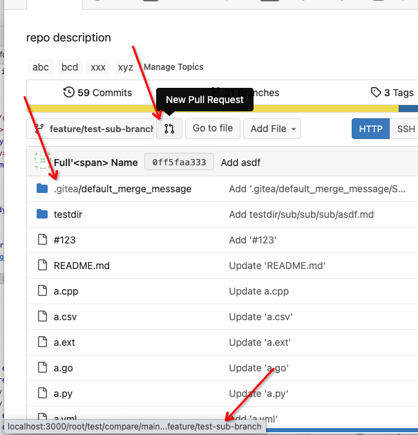
* Rework repo buttons

- Replace "New PR" and "Go to File" button with Icon Button
- Move all "Add File" actions into a dropdown button
- Remove most custom styling of clone buttons
- Margin and wiki tweaks

Buttons are now all equal height, mobile layout wraps gracefully.

Fixes: https://github.com/go-gitea/gitea/issues/13671
Replaces: https://github.com/go-gitea/gitea/pull/20375

Co-authored-by: Lauris BH <lauris@nix.lv>
Co-authored-by: zeripath <art27@cantab.net>
Co-authored-by: Lunny Xiao <xiaolunwen@gmail.com>
The button 'primary' class needs to be set in a synchronous script to prevent flicker of the button which was regressed recently, fixed that.

Additionally, reduced the two script tags to just one, the previous scripts were actually initializing the buttons thrice on the empty repo page, now it only initializes once. Finally, removed duplicate code and re-used the inline function in the update code as well.

I had to split out the script into a separate template as on the empty repo page, the script needs access to the clone URL span in the example text, which is rendered below the clone buttons, so buttons and script could not be combined.