Some small dashboard tweaks:

- Remove margin-bottom from divider so first item does not appear to
have un-equal margins
- Restore previous icon color
- Add slight margin-right to icon

Before:
<img width="783" alt="Screenshot 2023-08-31 at 00 10 28"
src="b75f70d7-8704-4afb-866d-fea0484c52d4">

After:
<img width="783" alt="Screenshot 2023-08-31 at 00 10 08"
src="50ed0c47-6f7c-449e-a054-13091369d43f">

---------

Co-authored-by: wxiaoguang <wxiaoguang@gmail.com>
Each change is tested manually line by line. There are too many changes
so I can't share dozens of screenshots.

In short:

1. `ui right` could be still used in `ui top attached header`, because
there is a special case.
2. A lot of `ui right` are just no-op, so they can be removed safely.
3. Some of the `ui right` should be replaced by `gt-float-right` (to
avoid breaking, leave them to the future).
4. A few of the `ui right` could be rewritten by flex.
Fix#26731
Almost all "tabindex" in code are incorrect.
1. All "input/button" by default are focusable, so no need to use "tabindex=0"
2. All "div/span" by default are not focusable, so no need to use "tabindex=-1"
3. All "dropdown" are focusable by framework, so no need to use "tabindex"
4. Some tabindex values are incorrect (eg: `new_form.tmpl`), so remove them
Co-authored-by: Giteabot <teabot@gitea.io>
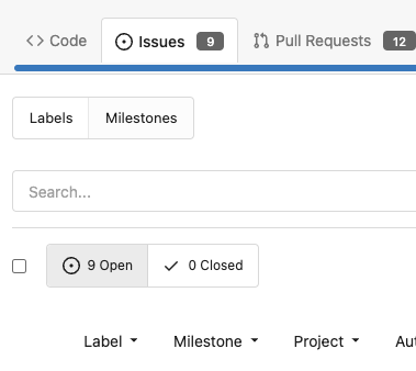
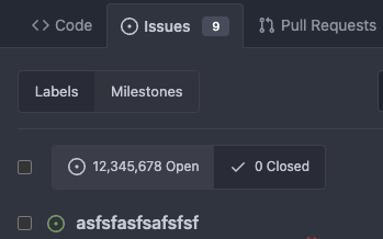
This PR has multiple parts, and I didn't split them because
it's not easy to test them separately since they are all about the
dashboard page for issues.
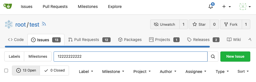
1. Support counting issues via indexer to fix#26361
2. Fix repo selection so it also fixes#26653
3. Keep keywords in filter links.
The first two are regressions of #26012.
After:
71dfea7e-d9e2-42b6-851a-cc081435c946
Thanks to @CaiCandong for helping with some tests.
This PR introduces a new UI element type for Gitea called `flex-item`.
It consists of a horizontal card with a leading, main and trailing part:

The idea behind it is that in Gitea UI, we have many cases where we use
this kind of layout, but it is achieved in many different ways:
- grid layout
- `.ui.list` with additional hacky flexbox
- `.ui.key.list` - looks to me like a style set originally created for
ssh/gpg key list, was used in many other places
- `.issue.list` - created for issue cards, used in many other places
- ...
This new style is based on `.issue.list`, specifically the refactoring
of it done in #25750.
In this PR, the new element is introduced and lots of templates are
being refactored to use that style. This allows to remove a lot of
page-specific css, makes many of the elements responsive or simply
provides a cleaner/better-looking way to present information.
A devtest section with the new style is also available.
<details>
<summary>Screenshots (left: before, right: after)</summary>


</details>
---------
Co-authored-by: Giteabot <teabot@gitea.io>
Should look exactly like before for normal dividers. "Horizontal" ones
look better because they no longer use image backgrounds.

<img width="917" alt="Screenshot 2023-06-27 at 19 07 56"
src="d97d8dec-6859-44a8-85ba-e4549b4dd9df">

<img width="914" alt="Screenshot 2023-06-27 at 19 05 58"
src="8bf98544-2d82-4ebf-ac68-d6dc237bd6b2">

<img width="1246" alt="Screenshot 2023-06-27 at 19 00 42"
src="36a6bb21-6029-4f53-8bee-535f55c66fed">

<img width="344" alt="Screenshot 2023-06-27 at 18 58 15"
src="a9e70aee-8e6b-4ea1-9e93-19c9f96aec6e">
<img width="823" alt="Screenshot 2023-06-27 at 18 56 22"
src="e7a497cd-f262-4683-8872-23c3c8cce32f">

<img width="330" alt="Screenshot 2023-06-27 at 19 21 11"
src="42f24149-a655-4c7e-bd26-8ab52db6446b">
- Set
[type=search](https://developer.mozilla.org/en-US/docs/Web/HTML/Element/input/search)
- Disable spellcheck
- Set maxLength 255 that I found in `templates/repo/issue/search.tmpl`
- Remove unnecessary `max-width`, it does nothing

---------

Co-authored-by: delvh <dev.lh@web.de>
Co-authored-by: Giteabot <teabot@gitea.io>
Numerous small UI fixes:

- Fix double border in collaborator list
- Fix system notice table background
- Mute links in repo and org lists
- Downsize projects edit buttons
- Improve milestones and project list rendering
- Condense milestone list entry to a single line of "metas"
- Mute ".." button in repo files list
Various fixes to pages or elements which were looking ugly on mobile.
<details>
<summary>Screenshots</summary>


</details>
Co-authored by @silverwind
---------
Co-authored-by: silverwind <me@silverwind.io>
- Fix and improve mobile navbar layout
- Apply all cleanups suggested in
https://github.com/go-gitea/gitea/pull/25111
- Make media query breakpoints match Fomantic's exactly
- Clean up whitespace in class on navbar items

Mobile navbar before and after:
<img width="745" alt="Screenshot 2023-06-08 at 08 40 56"
src="ca84b239-b10f-41db-8c06-dcf2b6dd9d28">
<img width="739" alt="Screenshot 2023-06-08 at 08 41 23"
src="09133c54-eb7e-4110-858c-ead23c3b7521">

---------

Co-authored-by: wxiaoguang <wxiaoguang@gmail.com>
Co-authored-by: Giteabot <teabot@gitea.io>
Was only an issue on arc-green:

### Before
<img width="313" alt="Screenshot 2023-05-17 at 23 33 15"
src="0f6916c6-c6c3-43c8-84cc-24b0a9800a43">

### After
<img width="310" alt="Screenshot 2023-05-17 at 23 32 52"
src="207d3d7f-ce6f-4170-b426-e743be760185">

Co-authored-by: Giteabot <teabot@gitea.io>
- Make code block rendering via backticks work
- Remove link color unless hovered
- Remove table stripes and fix stripes rendering on dark theme for other
tables
- Introduce new `button-link` class discussed previously for buttons
that look and act like links and apply it to the two right-side buttons
- Reduce box padding by 8px on each side
- Fix "Mark all read" button margin-right
- brighten `--color-markup-code-block` on arc-green

### Before
<img width="1216" alt="Screenshot 2023-05-10 at 20 00 30"
src="66da9ec2-dd09-4ef0-8f1d-1822a18b6b43">
<img width="1211" alt="Screenshot 2023-05-10 at 20 00 48"
src="f48e30a2-9a00-4723-93aa-79b97ca0ba0c">

### After
<img width="1222" alt="Screenshot 2023-05-10 at 20 09 59"
src="c956e0d0-b3d9-42a4-a3ed-f0431c22bf3f">
<img width="1218" alt="Screenshot 2023-05-10 at 20 05 34"
src="f72c1628-3961-4c28-9263-07cdf7531316">
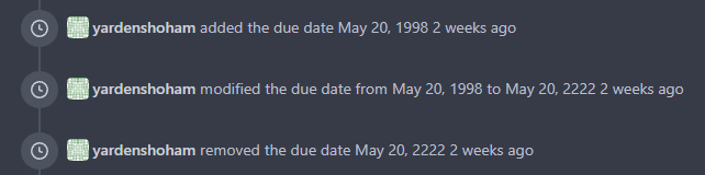
This refactors the `shared/datetime/short|long|full` templates into a
template helper function, which allows us to render absolute date times
within translatable phrases.
- Follows #23988
- The first attempt was in #24055
- This should help #22664
Changes:
1. Added the `DateTime` template helper that replaces the
`shared/datetime/short|long|full` templates
2. Used find-and-replace with varying regexes to replace the templates
from step 1 (for example, `\{\{template "shared/datetime/(\S+) \(dict
"Datetime" ([^"]+) "Fallback" ([^\)]+\)?) ?\)?\}\}` -> `{{DateTime "$1
$2 $3}}`)
3. Used the new `DateTime` helper in the issue due date timestamp
rendering
# Before
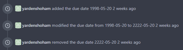
# After
---------
Signed-off-by: Yarden Shoham <git@yardenshoham.com>
Co-authored-by: wxiaoguang <wxiaoguang@gmail.com>
One of the steps in #23328


Before there were 3 different but similar functions: dict/Dict/mergeinto

The code was just copied & pasted, no test.

This PR defines a new stable `dict` function, it covers all the 3 old
functions behaviors, only +160 -171


Future developers do not need to think about or guess the different dict
functions, just use one: `dict`

Why use `dict` but not `Dict`? Because there are far more `dict` than
`Dict` in code already ......
Follow:
* #23574
* Remove all ".tooltip[data-content=...]"

Major changes:

* Remove "tooltip" class, use "[data-tooltip-content=...]" instead of
".tooltip[data-content=...]"
* Remove legacy `data-position`, it's dead code since last Fomantic
Tooltip -> Tippy Tooltip refactoring
* Rename reaction attribute from `data-content` to
`data-reaction-content`
* Add comments for some `data-content`: `{{/* used by the form */}}`
* Remove empty "ui" class
* Use "text color" for SVG icons (a few)
This branch continues the work of #23092 and attempts to rid the
codebase of any `nil` contexts when using a `RenderContext`.

Anything that renders markdown or does post processing may call
`markup.sha1CurrentPatternProcessor()`, and this runs
`git.OpenRepository()`, which needs a context. It will panic if the
context is `nil`. This branch attempts to _always_ include a context
when creating a `RenderContext` to prevent future crashes.

Co-authored-by: Kyle D <kdumontnu@gmail.com>
This includes pull requests that you approved, requested changes or
commented on. Currently such pull requests are not visible in any of the
filters on /pulls, while they may need further action like merging, or
prodding the author or reviewers.

Especially when working with a large team on a repository it's helpful
to get a full overview of pull requests that may need your attention,
without having to sift through the complete list.
The main purpose of these home pages should be getting an overview of
what's going on or needs attention. Recently updated is a better default
than newest for that purpose, to avoid missing active issues and pulls
that were not created recently.

The default sorting order in repository issues and pulls remains newest.
Repositories in an organization are already sorted by recently updated.

---------

Co-authored-by: Jason Song <i@wolfogre.com>
Co-authored-by: Lunny Xiao <xiaolunwen@gmail.com>