If dropdown is marked as required, we should not provide the `remove`
button.
This will cause user may post empty value which seems like a bug.
Definition:

Post request form:

Result:

Close#24625
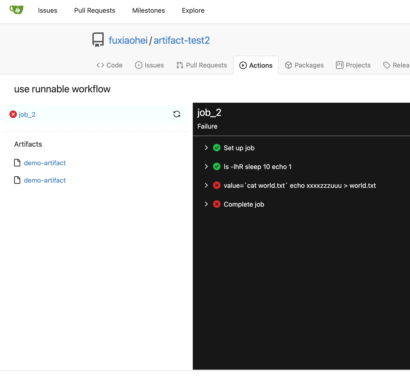
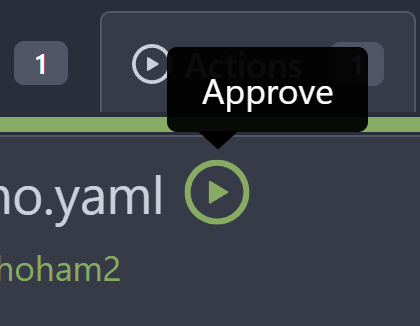
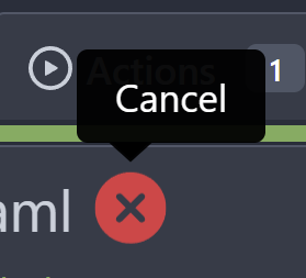
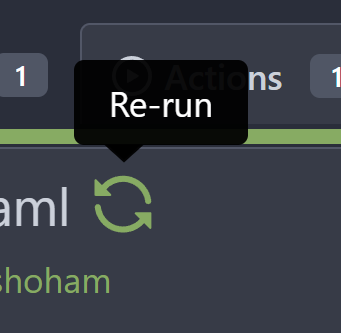
Main changes:
1. For the left panel, show rerun icon only on hover, and add style when
the job is selected, and removed icon on the "rerun all" button and
modify the text on the button
cc437a17-d2e9-4f1b-a8cf-f56e53962767
2. Adjust fonts, and add on hover effects to the log lines. And add
loading effect when the job is done and the job step log is expanded for
the first time. (With reference to github)
2808d77d-f402-4fb0-8819-7aa0a018cf0c
3. Add `gt-ellipsis` to `step-summary-msg` and `job-brief-name`
<img width="898" alt="ellipsis"
src="e2fb7049-3125-4252-970d-15b0751febc7">
4. Fixed
https://github.com/go-gitea/gitea/issues/24625#issuecomment-1541380010
by adding explicit conditions to `ActionRunStatus.vue` and `status.tmpl`
5. Adjust some css styles
---------
Co-authored-by: silverwind <me@silverwind.io>
There was some recent discussion about this in Discord `ui-design`
channel and the conclusion was that
https://github.com/go-gitea/gitea/issues/24305 should have fixed their
OS font installation to have semibold weights.

I have now tested this 601 weight on a Windows 10 machine on Firefox
myself, and I immediately noticed that bold was excessivly bold and
rendering as 700 because browsers are biased towards bolder fonts. So
revert this back to the previous value.
Visually, nothing should have changed.
Changes include
- Convert most `<a [no href]>` to `<button>` when (re-)viewing files:
- `<a [no href]>` are, by HTML definition, not a link and hence cannot
be focused
- `<a class="ui button">` can now be clicked (again?) using
<kbd>Enter</kbd>
- Previously, the installed keypress handler on `.ui.button` elements
disabled it for links somehow
- The `(un)escape file`, the `expand section` and the `expand/collapse
file` buttons can now be focused (and subsequently clicked using only
the keyboard)
- You can now press <kbd>Space</kbd> on a focused `View file` checkbox
to mark the file as viewed.
- previously, this was impossible as this checkbox listened on the wrong
event listener

The `add code comment` button has been left inaccessible for now as it
requires quite a bit of extra logic so that it is unhidden when it is
focused (you can otherwise focus it without seeing it as you are not
hovering on the corresponding line).

---------

Co-authored-by: silverwind <me@silverwind.io>
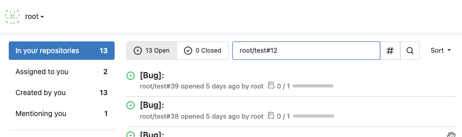
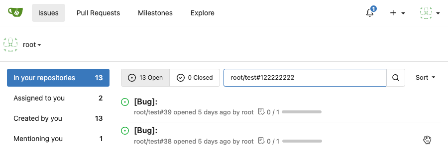
This PR is to allow users to specify status checks by patterns. Users
can enter patterns in the "Status Check Pattern" `textarea` to match
status checks and each line specifies a pattern. If "Status Check" is
enabled, patterns cannot be empty and user must enter at least one
pattern.
Users will no longer be able to choose status checks from the table. But
a __*`Matched`*__ mark will be added to the matched checks to help users
enter patterns.
Benefits:
- Even if no status checks have been completed, users can specify
necessary status checks in advance.
- More flexible. Users can specify a series of status checks by one
pattern.
Before:

After:

---------
Co-authored-by: silverwind <me@silverwind.io>
The "mirror" table and "repository" table might be out-of-sync in some
cases.
It means that "IsMirror=true" but "Mirror=nil"
This PR removes unnecessary "Mirror" field, rename "Mirror" to
"PullMirror" and fix nil panic bug.
Screenshot of changed templates:


We should just show all runs. This removes the filtering altogether.
- Replaces https://github.com/go-gitea/gitea/pull/24553
# Before


# After

---------
Signed-off-by: Yarden Shoham <git@yardenshoham.com>
Clean up a few cases where avatar dimensions were overwritten via CSS,
which were no longer needed or were possible to set via HTML width.

Also included are two small fixes:

- Fix one more case of incorrect avatar offset on review timeline
- Vertically center avatars in review sidebar

There is more to be done here, but some of the work depends on Fomantic
`comment` module removal, or in the case of org member lists, a refactor
of the `avatarlink` template to accept a size.

<img width="371" alt="image"
src="9c5902fb-2b89-4a7d-a152-60e74c3b2c56">
<img width="306" alt="image"
src="c8d92e2a-91c9-4f4a-a7de-6ae1a6bc0479">

---------

Co-authored-by: Giteabot <teabot@gitea.io>
Fix regression from https://github.com/go-gitea/gitea/pull/24476 where
the `svg.svg` class misaligns SVG icons across the site and streched
buttons unintentionally in vertical height.

Before (button 30.3px):
<img width="157" alt="Screenshot 2023-05-11 at 22 09 42"
src="0fd137ab-ab52-4cf8-afca-c45776d526d0">

After (button 30px):
<img width="160" alt="Screenshot 2023-05-11 at 22 09 59"
src="4b741f4b-0fd2-4fae-9bee-16a7deb098e8">

[vertical-align:
middle](https://developer.mozilla.org/en-US/docs/Web/CSS/vertical-align)
is not suitable to align icons to text because

> Aligns the middle of the element with the baseline plus half the
x-height of the parent.

Example of `vertical-align: middle` from MDN:

<img width="232" alt="Screenshot 2023-05-11 at 22 29 28"
src="179fb756-85a1-4cab-8219-1a4958f333e2">

So I think the
[existing](365bb77a54/web_src/css/svg.css (L3))
`vertical-align: text-top` is generally still the best bet:

<img width="241" alt="Screenshot 2023-05-11 at 22 34 24"
src="0cd6edf5-12c0-4bdb-8771-a900f5ba2d35">

Co-authored-by: Giteabot <teabot@gitea.io>
- Make code block rendering via backticks work
- Remove link color unless hovered
- Remove table stripes and fix stripes rendering on dark theme for other
tables
- Introduce new `button-link` class discussed previously for buttons
that look and act like links and apply it to the two right-side buttons
- Reduce box padding by 8px on each side
- Fix "Mark all read" button margin-right
- brighten `--color-markup-code-block` on arc-green

### Before
<img width="1216" alt="Screenshot 2023-05-10 at 20 00 30"
src="66da9ec2-dd09-4ef0-8f1d-1822a18b6b43">
<img width="1211" alt="Screenshot 2023-05-10 at 20 00 48"
src="f48e30a2-9a00-4723-93aa-79b97ca0ba0c">

### After
<img width="1222" alt="Screenshot 2023-05-10 at 20 09 59"
src="c956e0d0-b3d9-42a4-a3ed-f0431c22bf3f">
<img width="1218" alt="Screenshot 2023-05-10 at 20 05 34"
src="f72c1628-3961-4c28-9263-07cdf7531316">
Fixes#24145
To solve the bug, I added a "computed" `TargetBehind` field to the
`Release` model, which indicates the target branch of a release.
This is particularly useful if the target branch was deleted in the
meantime (or is empty).
I also did a micro-optimization in `calReleaseNumCommitsBehind`. Instead
of checking that a branch exists and then call `GetBranchCommit`, I
immediately call `GetBranchCommit` and handle the `git.ErrNotExist`
error.
This optimization is covered by the added unit test.
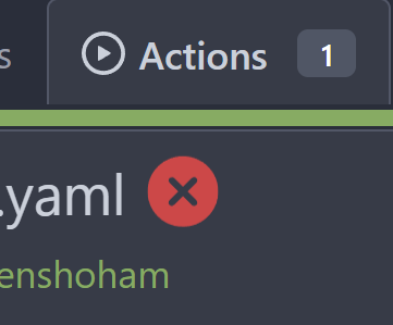
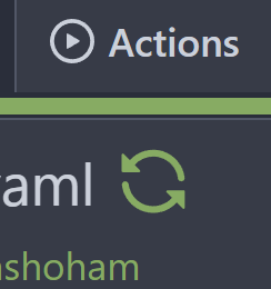
To clearly communicate the current state of the action


---------
Signed-off-by: Yarden Shoham <git@yardenshoham.com>
- Very similar to #24550

The correct thing to do is to translate the entire phrase into a single
string. The previous translation assumed all languages have a space
between the "added on" and the date (and that "added on" comes before
the date).

Some languages, like Hebrew, have no space between the "added on" and
the date. For example:
```ini
added_on=נוסף ב-%s
```
("added" becomes נוסף, "on" is ב and when paired with a date we use a
dash to connect ב with the date)

---------

Signed-off-by: Yarden Shoham <git@yardenshoham.com>
Co-authored-by: delvh <dev.lh@web.de>
The correct thing to do is to translate the entire phrase into a single
string. The previous translation assumed all languages have a space
between the "joined on" and the date (and that "joined on" comes before
the date).

Some languages, like Hebrew, have no space between the "joined on" and
the date. For example:
```ini
joined_on=נרשם ב-%s
```
("joined" becomes נרשם, "on" is ב and when paired with a date we use a
dash to connect ב with the date)
I am not sure what "new-menu" means, but I think we need to fix these
problems:

1. it shouldn't have "stackable", which makes the items stacked when
width is small. the `new-menu` already has `overflow: auto`
2. `justify-content: center` doesn't work with `overflow: auto` (for
small width), so use `margin: auto`
*
https://bhch.github.io/posts/2021/04/centring-flex-items-and-allowing-overflow-scroll/
3. `runner-new-menu` is dead code (copying & pasting ?)
Partial regression of #24393, not only regression, but broken for long
time, 24393 didn't really improve it but used wrong `overflow: scroll`.

Actually, that "ui secondary filter menu labels" shouldn't be set as
scrollable (I missed that at that time), the problem is: if a "ui menu"
has "dropdown" items, then it should not be scrollable. Otherwise the
dropdown menu can't be shown correctly.

And there are more problems:

* The "issue-filters" shouldn't be used anywhere else (copying&pasting
problem again ....)
* There is also an "issue-actions" container, it should also be fixed.
* There are similar problems on the milestone page.
* The old comment in code: "grid column" doesn't work well.

The major changes of this PR are: use "flex: 1" instead of "ui grid
column".

After this PR, not 100% perfect but much better than before.